

Responsive Web Design Services
Get to know what exactly is responsive web design and how to accomplish it on your own website.

What is responsive web design?
It is a website that can properly adjust its content on every page to the device and screen it is being used on. By creating web pages that look good on all devices no matter the screen size and viewport. A classic example is to make sure that any image on your website adjusts its size in width and height on a desktop screen whenever you make the browser screen smaller or bigger depending on your needs to view the page differently.
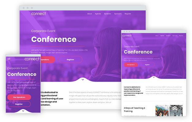
The video below shows how I was able to make my browser screen size in width smaller and bigger. This causes the columns and images to adapt to the browser screen size I changed to.
You can also see the effects of proper responsive web design services by zooming in and zooming out of a browser screen. This should also make the content in your web design adapt to the level of zoom that you want to view the content in. Like the video below shows.
Whenever a website properly adjusts to the change in browser screen size or when it is viewed correctly the way you want it to on different devices such as desktop, tablet, and mobile phone, then the responsive web design services have been done correctly. Even when you rotate a mobile phone or tablet to view in portrait or landscape mode, the web design should also adapt, like the video below shows.
When responsive web design services are done accurately, it gives the visitors of your website a better experience, otherwise known as a greater User Experience. This is because the website is suited to be viewed on many devices in the different ways the visitor wants to see and interact with the website through the device.
What are the benefits of responsive web design services?
- As it was already mentioned, accurate and tested responsive web design of websites can have a greater User Experience to visitors. Other benefits of valid responsive web design are:
- Attract a wider audience by showing a website on devices of many different sizes and shapes.
- To appear higher in search engine results because search engines reward responsive websites.
- A design that adapts to all devices meaning better design and brand consistency.
- Users will spend more time on your website because it can easily be viewed. Otherwise, the visitor will go away from the website and it will have a higher bounce rate.
- Error-free responsive web design services also increase conversion rates. By reaching a larger and more targeted audience and giving a smoother experience, website owners can see an increment in calls and form submissions or other Calls To Action on their website.
- More traffic to a website because since 2015, the majority of website visits have come from mobile phone devices.
How to achieve accurate responsive web development?
A web developer or web designer can achieve making a web page responsive by using HTML and CSS so that it automatically resize on all devices.
The following viewport meta tag should be added on all web pages so that they can be responsive:
<meta name="viewport" content="width=device-width, initial-scale=1.0">
In summary, the viewport meta tag gives instructions to the browser on how you want to control the web page's dimensions and scaling. In other words, it lets you adjust the web page to the device's screen size.
To make any image responsive, you need to add a CSS width property of 100%, which I recommend adding to all images and also add a max-width CSS property. The max-width helps for the image to not go beyond or never scale up a certain width size when the web page is viewed but also lets the image scale down when the width of the image is set to 100%.
To resize text, I would recommend using media queries. By setting the font-size CSS property of a text to be smaller depending on the width of the device. Like I briefly mentioned, using media queries is the way to go when trying to make a web page responsive. By using media queries, you can define completely different CSS properties of an HTML element for different browser sizes.
In the following video, I demonstrate how to apply various CSS properties to make elements mobile-friendly:
The whole point of making a web page responsive is to make it available for all screen sizes, especially mobile. Nowadays, there are many responsive web design frameworks available that are easy to use to make your website responsive. By adding the necessary CSS files of the responsive web design framework to your website, you can immediately see a difference in design. You just need to follow their documentation to make your website responsive.
Some of the most popular frameworks are:
How can you test the responsiveness of a web page?
There are 2 common ways to test the responsiveness of a website and they are using special tools and to use your browser because most modern browsers have a tool to inspect your web page.
For example, in the following video, I show how to go about checking the responsiveness of my website by using the Microsoft Edge inspector tool. This lets me view the web page on different mobile and tablet devices, it lets me rotate the page as portrait or landscape view, and also see how it's going to look like on some common device sizes.
You can also use special tools like Browserstack, which is one of the world's leading software testing platforms, to check the responsiveness of a web page. In the following video, I show how easy it is to use Browserstack:
What are some responsive website examples?
It's always good to see for yourself responsive web design examples that are currently available online. Below I have provided a list of great examples, that you can test the responsiveness by resizing your browser on your desktop and view the examples on a tablet and mobile phone device:
- Dribble
- Github
- KlientBoost
- Magic Leap
- Shopify
- Web Developer - Gustavo Amezcua
- Best Message Center
- Miracle Services Green Carpet Cleaning
How to use responsive web design frameworks to make your website responsive?
I demonstrate in the video below, how to make an adaptive design web page use a responsive design by using the web design framework of Bootstrap. Meaning, it will be responsive on desktop devices as right now because of the adaptive design that is being used, it doesn't adapt to a desktop browser screen being resized to be smaller:
What is the difference between responsive and adaptive web design?
There is a very important thing to notice when making a responsive website. It is to make sure that a website takes a certain approach in making it available to most devices. By knowing if the web design will be responsive or adaptive.
A responsive web design adapts a single-page version to the different devices. While an adaptive web design delivers a different version of a web page depending on the device it's being viewed on.
With a responsive design, any browser on any device will access the CSS code in charge of making a web page adjust the elements inside it. The CSS code will make the web page render differently depending on the media queries and rules inside it.
Adaptive design works by using a script to check the screen size. Once the script knows what is the browser screen size of the device, it will show the web page but using a different template. You could say a different design, version, or template of the web page is shown because not only are certain CSS properties being applied according to the device but distinct HTML code is also being used.
An easy way to notice if a website has an adaptive or responsive web design applied is to open the website on a desktop device such as a computer or laptop and to make the browser window smaller. Most of the time, not all of the elements on the web page will adapt to having a smaller browser size on a desktop device because the same device is still being used.
In my opinion, there are no drawbacks to using an adaptive web design because of the following reasons:
- The elements of a web page can be shown or hidden on desktop, tablet, and mobile phone devices.
- An adaptive design will still provide the benefits of a website working on different devices.
The website of The Home Depot is an example of an adaptive web design being used.
Share on Social Media
Get a Modern Logo and Website
in 24 to 48 Hours
Our Customer Service Will Build the Complete Website For You For Free.